Monday, 27 October 2014

K.I.S.S.

Further to yesterday's post about drawing with coloured pencils, I found this image in my files (after a little looking. I had given it a strange name, so it wasn't where I thought it should be. Problem rectified), and it the only image I have of the original drawing, so I am relieved to have found it. The original sold. For a tidy sum. I love that someone else loved it enough to buy it.

Bactrian, Megan Hitchens, 2011, black pencil on paper

It is a baby bactrian camel. So unbelievably cute, and another glorious fibre animal.

This is even simpler than the Snow Leopard and the Bison, as it is one colour on white. Just a black pencil. Not graphite, not a 2B drawing pencil. A black colour pencil. That's all. Different pressure, different number of layers gives me different shades, from a pale silvery grey through to the deep black wells of the eyes.

You don't need a huge number of colours to make something beautiful (although you certainly can do that. Colour is a wonderful thing). Keeping it simple can work wonders too. There is a serenity to this that cannot be achieved with a broader palette.

Anyway, I'm happy with it.

Sunday, 26 October 2014

Touchwood

I am having a bit of a Catweazle day. There were specific plans for today, but I have a child home sick. Again. So there it goes.

Son went to camp last week and had a ball. He came home more confident, more willing to do stuff for himself, but also worn out (good) and with no voice (bad). He spent the weekend cranky and croaky and yesterday his eating petered out. This morning? Temperature, sore throat, day in bed.

I had planned to work on the abstracts. About 2 am this morning I got a vision of a new one and desperately want to set up the imprimatura for it and put another layer on the other two. But no. Sooooo, drawing.

Made a start on a portrait of my friend, Arlene. Remember when I did Riyaz I said I wanted to do Arlene, but on grey? The paper is a beautiful colour, but it's wrong for this. So that needs a rethink. However, the colour is right for a simple drawing of Ghandi, which I have started, but something isn't right and I can't see what it is. So the best thing for the moment is to turn it over for a few hours and then look again.

I thought about working on the shells, but... I don't know... just no. Or at least not right now.

Like I said, a Catweazle day

"Nothing works"

So, in a desperate bid to feel productive, I thought I would regale you with "what you can do with coloured pencils".

You know, just basic Derwent colour pencils. Not watercolour pencils, just the ordinary ones. I bought them in a tin a couple of decades ago. They have lasted this long because I don't use them very much, but I have such fun when I do. I really should get them out more often.

Snow Leopard, Megan Hitchens, 2011, coloured pencil on paper

Anyway, these two drawings were done a few years ago. I like them both for two reasons. One, I think they are quite good (and I don't normally feel so satisfied with what I do) and two, they use very limited colours. There are only four in each one.

Bison, Megan Hitchens, 2011, coloured pencil on black paper

They were both done from photographs. The snow leopard, I don't know where it came from. One of my photos from a zoo visit? (I spent a lot of time at the snow leopard enclosure) One of the hundreds of photos of snow leopards around? I don't know. Sadly, there are more photos of snow leopards than there are actual snow leopards. And the more the Chinese government opens up access to Tibet, with the fast trains and what have you, the more their numbers plummet. Passage for poachers was greatly facilitated by the train and, with backhanders and bribes, the government does nothing to curb the trade in snow leopard pelts. Or at least nothing serious.

The bison came from an ad in Wild Fibres. I have read a lot about bison fibre, how soft it is, its thermal properties, and would love to spin some. Maybe one day. I have some yak fibre sitting waiting its turn. Mmm, fibre.

I digress.

The snow leopard is mainly black and yellow ochre with a little pink and a touch of sienna. That's it. I removed all trace of the background and any outline because I wanted it to just be in the page. The white of the paper became the background and the main colour of the leopard Minimal work, maximum effect.

The bison is yellow ochre, two browns and white. That's it. The black paper does most of the work for me, just as the white did with the snow leopard.

I keep telling my mum not to add hard outlines to her drawings and paintings. Sometimes it is a good idea and serves the outcome well, but a lot of the time it just flattens the image and makes it look odd. And there is a difference between a defined edge (such as along the bison's nose) and an outline. The trick is to see what's there rather than what your brain is telling you is there. Brains lie. Plus, one of the tasks of fur is to smudge the outline, making the animal harder to detect. Have you noticed that a lot of predators have fur while their prey have hair? Silly prey.

The point of all this is, I suppose, you don't need a lot of tools and materials to create something. Go for the best quality you can get (it'll last longer and give you a better result), but you can start with a small amount, or a limited number (which makes it easier to afford).

And the point for me today is to remember that not every day is a Catweazle day.

Tuesday, 21 October 2014

Rise Up - What Happens in an Artist's Mind at 2 am

I don't normally write about the Abney Park drawings that I do, but I am making an exception this time.

The main reason I have been doing these drawings is to hopefully give a smile to some people whose creative abilities I respect and admire. It's such a small thing in return for such wonderful music. But it has benefits for me as well. I try to draw everyday, a task which is easier when there is a defined point to a drawing. So these are great practice. They are also their own challenge as they come with a deadline. I have missed three (one by five days, thanks to no internet connection) and made three. Normally the drawings are a product of my slightly bizarre sense of humour.

Kristina Erickson's drawing is a little different.

Rise Up, Megan Hitchens 2014, white, sanguine and black chalk

Nothing really funny about it.

I struggled with this. What you see above is the fourth attempt. Having not had the pleasure of seeing the band play live (one day...) and therefore not having my own photos and sketches to work with, I rely on photos by others for each of my drawings. I try as much as possible to not just copy, to bring something new, even if it is just a giant mutant upside down hamburger (I warned you about the bizarre sense of humour) or something new in the background, or altering the clothes. But most of the photos online of Kristina are her playing the piano or keyboard (outstanding pianist), or looking beautiful. Or looking beautiful and playing the piano. I could have done a simple portrait, but not having my own photos to reference, or permission to reference someone else's, I am really uncomfortable doing that.

And then the germ of this idea appeared in my head. About 2am, which seems to be the normal arrival time for such things. Have nightmare or strange dream. Wake in fright or confusion. Think about drawings. That's the way it goes.

So I did some quick sketches to work out poses, layout, what have you. I looked at LOTS of posters from the Paris Uprising and the Russian Revolution and the early years of Soviet Russia. I thought a lot about "Retrograde" and how I feel about it and why.

"Retrograde" is the sequel to "Wrath of Fate". Both are books written by Robert Brown, about Abney Park's adventures in a time travelling airship called the Ophelia. They are fantastic. I love them both, but gosh they make my brain churn. You can buy them here.

They deal very much with ideas of survival and oppression and revolution. Changing the world, for better or worse. Responsibility and consequence. Notions of humanity and freedom. Being the change you want to see (thanks, Ghandi).

And Robert Brown writes Kristina as one of the great literary heroines. Which is sort of where the drawing comes from.

There are two characters in the books who seek to change the world "for the better", although they have very different ideas of what that means. There is Robert, who, on finding he has become captain of a time-travelling airship, decides to go through history fixing things. Righting wrongs. Saving lives. Big picture stuff. Noble. Well-intentioned. As you do.

For instance, he goes to the Seige of Arcot and lends a hand. I loved that chapter. A strong independent India just under 200 years before it actually happened. But after the initial "Yay! Up yours, Clive!" reaction, I couldn't help thinking, "There goes Ghandi". There goes Bangladesh, now I come to think of it. My birth country would just have been a province in India, a state if it was lucky.

Then there is Victor, who wants to save the world - from humanity. He has big plans and the means to execute them. He puts people in place who will solve the problems he perceives and he deliberately asks no questions about how they achieve the ends. His goals are noble. He is  well-intentioned, after a fashion. But he sees humans as less than the animals he seeks to save, and he sees himself as greater. He also sees himself as right in all things.

The world Victor and his followers fashion is strange and brutal, cruel and oppressive. Most of humanity is confined to walled cities, kept in the dark and the dirt and the squalor so that those at the top can be comfortable and well-cared for. The animals engineered and resurrected are released into the wild, to feed on those who have escaped the cities, to feed on those the state no longer needs. It is a terrible vision.

So there are our two world changers. Two men doing their big picture stuff. While the real world changer is someone else who tries to get people to change themselves.

Victor is not touched by the horrors he metes out to other lesser mortals. Robert, while suffering trials and tribulations and trying desperately to save his family, does not experience the worst of the new world. Kristina does. She is shot and captured while trying to save her children and ends up as little better than a slave in one of the cities.

It is often the way of things that the person who lights the flame is not the politician on the podium, or the general leading from the rear, or anyone else making "the grand gesture". It is someone caught up in what is really happening. Someone who has to experience the real consequences of the actions of those higher up. Someone who not only says "enough" but who finds a way to get others to say it too. These are the real heroes, the real world changers. And they often go unsung because their action is not grand.

I love literary Kristina, the way she struggles on while the world tries to beat her down. She fights back with what she has - her wits and her words. Uncovering a terrible, haunting truth she finds a way to make others see it, to see a thing that wakes them to what their lives really are. Those who see make their own decisions, carry the message further, find a way to identify each other.

Even with the jackboot of authority literally on her neck, Kristina continues to defy the oppressors, to use her words and her very defiance as weapons. What more could you want in a literary heroine? Beats the hell out of Anna Karenina.

The posters of the Paris Uprisings and Soviet Russia have long fascinated me and I have spent the last few days getting re-acquainted. Yet again I was struck by a number of things. Firstly, the use of women.

In the French posters women are largely symbolic (and not just in France. Look at the example from the US on the right below). They stand in for ideas, such as Liberty and Equality. They are not dressed for fighting or for work, they are there for inspiration for men. In the Soviet posters women are workers, revolutionaries, heroes. Okay, they are idealised, but the men are idealised too. The women are portrayed as active members of the Revolution. I am not saying Soviet Russia was a feminist utopia, there was never a female head of the politburo, for instance, but it was not the same as the West. And it was not unusual to have women as the central active figures on posters. They were there to inspire everyone, just as the men were.

See what I mean?

Another thing that has often had me wondering is the way posters reflect the rewriting of history. You find people or events being used in particular ways that don't necessarily reflect the facts. Maybe they are reflecting the spirit of the facts rather than the facts themselves. Maybe they are compressing a complex narrative into a single composite image. Maybe the person portrayed no longer quite fits the current political agenda (but is still popular) and so their actions "need" to be massaged. Maybe the story has been "improved" for impact or convenience.

That's sort of what my drawing is. It is an imagining of a poster that might have been made after the events of "Retrograde". Whether her name is known or not, some have recognised Kristina as a revolutionary figure. But gone are the bloodied feet and battered body. She strides proudly in her worker's uniform and military hat, leading an automaton child while humans and automata alike, their banner proudly unfurled, attack a factory/change cage topped by government offices. This isn't a moment that happened. The truth in the story was very different and much more brutal and frightening, its outcomes far more uncertain. But hey, that's propaganda for you.

And if you go looking at Soviet posters you'll find the factory-like structure and some of the figures behind Kristina. I have more or less lifted them from a poster from 1920, called "Death to Venture Capitalism". It's a great poster, catchy title, a bit weird. I was going to put "Rise Up" in Russian on the drawing, in the same style, but my Russian is almost non-existent these days, and the image is probably better without it.

The revolutionary automata are based very heavily on Gyrod, an automaton who features in "Wrath of Fate" and "Retrograde". I did this on purpose and offer apologies to Robert Brown and to Juan Pablo Valdecantos Anfuso (the illustrator) for borrowing their wonderful imagery. It's funny, I went through both books looking for illustrations of automata that I was sure were there, only to find they weren't. It turns out that most of the pictures I thought were in the books had been drawn by words, not by pencils or pens. Don't you love a book that can do that?

And what else could I choose for music other than "Rise Up"? (warning. One swear word contained therein)


Thursday, 16 October 2014

Through Not Quite Rose Coloured Goggles...

Not a lot has been going on on the art production front. Lots of things this week with the house and family and whatnot. One of the things I had to do was take the Steamgoth up to Newcastle for an appointment.

She has Irlen Syndrome, which is a form of dyslexia. It is treated, very effectively I might add, with coloured lenses. Two years ago I sat in a room at the Irlen Centre and listened to my child read, first in the halting, uninflected, disjointed way she had always read, skipping words, mistaking words, stumbling, no regard for punctuation. Then she held the carefully worked out colour combination of lenses to her eyes and for the first time in her life read fluently and with beautiful inflection and rhythm. Afterwards she said to me that she had never understood about punctuation because she had never been able to see it on the page in the jumble of the letters and all the shifting colours (without her glasses her eyes see all the refracted colours from the white, rather than just the white page).

AmbassadorMann Goggles, but hey, they're tinted.

Yesterday it was time for a check up. Have her lenses faded? (No, she takes really good care of them) Have her eyes altered? As in, is the current colour still right or does there need to be an adjustment? (Yes, just slight, but it does mean she'll be without her glasses for about three weeks. SHE asked if that could happen after her exams. Progress.) Her reading without the glasses has improved dramatically, but still not as dramatically as her reading with them.

Since getting the lenses she reads for pleasure, and is writing a novel. This from the child who would move heaven and earth to avoid reading or writing ANYTHING.

If ever you hear anyone say that the coloured lenses are useless, tell them to do more research, or talk to those who use them.

But I digress, because the Steamgoth isn't the subject of this post (well, not that I had planned).

As I wrote above, the appointment was in Newcastle. Wallsend to be precise. When we were finished (it took about an hour and a half - the process is quite involved), we wanted lunch. Having forgotten to ask some Newcastle friends for a lunch recommendation I decided that we would just drive in to Darby Street and see what we could find.

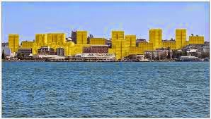
Newcastle skyline. Worth fighting for.

Darby Street is cafe central. It is not, however, ATM central. So we walked up the Hunter Street Mall to the ATM at the Newcomen Street corner. There used to be a Commonwealth Bank there, back in the days when banks provided a service rather than gouging us all for profits. My father-in-law was the manager of the business branch two doors down. There is still, thank goodness, an ATM.

Walking past the park in King Street was a little distressing. There are still large trees, but the Moreton Bay Figs are notable for their absence.

I haven't been in the Mall for years and the last time there were lots of empty shop fronts. It was dismal, largely deserted. Sad. Still licking its wounds from the earthquake so long before. Now it is a transformed space. Full of people, interesting shops, stalls (got some amazing doughnuts. The Steamgoth's was called The Goth. Mine was strawberry and rhubarb). I don't like to use the word "vibrant". It is so overused. But I can't think of a better one. So there it is, it was vibrant. The Steamgoth was very impressed. Wyong has nothing of interest for her and she was looking at the posters for clubs and the exhibition sign at the Gallery (Elliot Gruner. I wish we had had more time. I would have liked to see that), and all the cafes and shops. And as she said, the air is nicer.

There isn't a huge amount of parking at the top end of town, but the train stations were being well-used. The state government's plan to rip up the line is nothing short of vandalism. A decision proposed by crooks seeking a tidy profit and finalised by people who have no idea of Newcastle and care even less what ordinary people want or the city needs.

State govt proposal for Newcastle when the train line goes

We had lunch at a nice sushi place in Darby Street and then drove through Hamilton and Lambton and Jesmond, heading back to the link road to the M1, the Steamgoth's latest favourite, Bowie's Life on Mars, on repeat on the car stereo. All the while I was thinking, "I remember this part. So-and-so lives not far" or "we lived just over there" (the kids hate those detours, so I didn't do that yesterday. Although if we hadn't had to get back to pick up my son from school some of you may have had some unexpected visitors).

And I thought what I always think when I visit Newcastle (and which gives the spouse the horrors), I could move back tomorrow, without hesitation. It has its problems, everywhere does, but it's where I grew up and more than anywhere except Scotland it feels like home. Yesterday, driving around and walking from Darby Street to Hunter Street, I was so happy to be back. Today, sitting in Wyong, putting off cleaning up, I am filled with saudade. And all I want is to return.

And until the kids finish high school and the spouse retires, it isn't going to happen. So I'll raise a glass to the city of my youth and get back to normal life here. And go and do the cleaning.


Friday, 10 October 2014

Dear Diary

Still drawing Nautilus shells and planning the final drawings. I used to hate doing this in high school. The whole "process diary" thing used to get under my skin. Most artworks DON'T need it. I know what I am painting or drawing and I go with it. Maybe there's a sketch or rough draft. Maybe a test layout for a calligraphy piece, but that's it. Most of what I need can be carried out in my head first. A diary is, usually, not needed. I had several arguments with art teachers throughout my high school years. And proved on each occasion that all that malarky had not been necessary.

But occasionally something comes along that requires a bit more, and the Nautilus drawings fall into this category, partly because it is drawings plural that all have to work together, partly because I am doing quite different things with each of them and I am not sure about one of them. It still needs to be resolved. Several pages of the sketch book I keep by the computer seem to have become a mini process diary. Who'd have thought?

Look, a diary page. With things on it.

There are three drawings so far. There'll be at least three more. Plus the plans for the framing. Plus the finished works.

At this rate I may have acceptable documentation for HSC art.

Thursday, 9 October 2014

I'm a Golden Meanie

As in I am a huge fan of the Golden Mean. Or the Golden Ratio. Two quantities are in the Golden Ration if their ratio is the same as the ratio of their sum to the larger of the two quantities. Wikipedia has a good illustration of this. Look at the diagram at the top of their page, on the right hand side. If you look just below that diagram you'll see a Golden Rectangle. I love those. The Golden Ratio or Mean is commonly expressed with the Greek letter φ (phi). φ is an irrational number, like pi and has a value of 1.61803398874989..., usually written as 1.618.

Actually, I love geometry. I sucked at maths at school, partly because my brain is not wired that way, partly because I couldn't see any relevance for it. I still glaze over when I hear sine, cos and tan (and don't try and explain them, please. Lalalalalalalala). I can do long multiplication and long division, I can keep accounts and manage money. I don't need any more. And I love geometry.

Not trigonometry, geometry. The way the Greeks did it. With a straightedge and pair of compasses. You can draw any geometric shape or relationship with a straightedge and compass. No measurement marks, no protactor or set square. Fabulous. And I love sacred geometry. It is kind of nuts, but it is fun.

When I was in University way back when, I came across a series of articles by Robert Stevick on the use of geometry in Insular manuscripts. Dr Stevick is a mathematician, so that was his focus. I already knew a little of sacred geometry (it is used in quite a slab of Renaissance paintings) and I recognised the forms he was writing about. I looked at the pages he detailed and realised that the geometry was telling a story. It was more than just about beautiful structure (although that was in there too), it was about narrative. Suddenly something mathematical was relevant and my mind lapped it up.

I got really excited, I mean really excited, and ended up researching and writing a paper on the subject in my third year. If you have access to Project MUSE you can actually read it here (it is weird seeing your own name on a paper on the internet). I have been hooked ever since.

Recently I had an idea for a set of drawings based on a Nautilus shell that is in the Macleay Museum at the University of Sydney. I decided to do a little research on Nautilus shells and found a lot of people saying it forms a Golden Spiral based on the Fibonacci Sequence. In other words, it is a 90degree rotation Golden Spiral. Which it isn't. You can see that by looking at it. Its curve is much more gradual and fluid, amongst other things.


There are lots of videos on YouTube and articles on the net about how to draw a Fibonacci Spiral and about the Golden Mean and Golden Rectangles, some better than others. Most show Nautilus shells.

The Fibonacci sequence is 1,1,2,3,5,8,13,21,34,... Basically you add the first two numbers to get the third, then the second and third to get the fourth and so on. To make a Fibonacci spiral you construct squares with sides equal to each number in the sequence, rotating though 90 degrees as you go. Draw an arc through each and you make the spiral. What a lot of sites don't tell you is that the spiral is also made up of nested Golden Rectangles, although it is not a true Golden Spiral as it starts with two identical squares (a true one uses only Golden Rectangles). Close, but no banana.  It's not the Golden Spiral I am looking for.

So I tried to work out what was going on in a Nautilus shell and found this article. A 180degree rotation Golden Spiral. It all made sense. Except that when I looked at the diagram for the spiral I couldn't work out some of the numbers.

Eventually, after taxing my spouse's maths wiz brain, and then playing with compasses and straightedge, I worked out the obvious. All the rectangles are Golden Rectangles. All the ratios are Golden. It all fell into place. And I am suddenly drawing Nautilus shells like there is no tomorrow. They are no longer the Macleay shell (no real shell is a perfect Golden Spiral - nature likes order but it doesn't believe in straightjackets), but they will serve my purpose well.

The original diagram by Gary Meisner

Spouse initially gave me complicated decimal numbers to divide or multiply each line by to give me the lengths of other lines. But I got to thinking about that. There had to be an easier way. After all, Pythagoras knew nothing of Silicon Heaven. Hence the playing with compasses and the dawning realisation of the Golden Rectangles.

Here's an amazing thing about phi. Phi is 1.618, as I said at the beginning. If you add one to 1.618 you get 2.618 (big deal), which is also phi squared. Phi squared is the same as phi+1. So that large rectangle for the first four rotations of the Nautilus spiral is 2phi:2phi+1 or 2phi:phi+phi squared. I'm going with the first version because I can see the Golden Rectangle expressed in it. Gives me goosebumps just looking at it. I know, I know, I am weird.

Here's my reworking of Meisner's diagram.

On the diagram I have marked more or less the order in which points were made. I've deliberately left in some of the construction lines. The length of lines is marked in green. Look at the number of times certain measurements repeat themselves and the way everything expands but continues in proportion. The curves are labelled as rotations. They aren't arcs, they are not that regular. I have not marked "rotation 1" because it isn't. There are clearly others before it, constructed in smaller and smaller Golden Rectangles (don't hassle me, I'm not putting them in. I can draw them well enough without). The original square, from which all this was drawn, with just a straight edge and compasses, is marked in red. Its length is designated 1 and represents one unit rather than a measurement of something particular. This could go on forever, spiralling in and out, but that's the size I want.

There's so much you can do with geometric construction. Draw squares from circles, make perpendicular lines, draw Golden Rectangles (you sick of those yet? I never am), make hexagons, triangles, pentagons, octagons, fractals, carpet pages. You name it. Anyone interested?

Wednesday, 8 October 2014

Watching Paint Dry the Right Way

One of the great things about the web is the instantaneous nature of response. I put up my post yesterday and got instant feedback (I think I gave a friend a heart attack).

Needless to say, over-reading, over-thinking and over-analysing, seasoned with a good dose of impatience and not following advice means I did the tinting thing wrong.

Here's what I should have done - listened to Mark Calderwood and Cennino Cennini in the first place. Do each layer, allow to dry in between. Let the paper dry thoroughly. THEN weigh it down if it needs flattening out.

AND ACT WITHOUT FEAR.

I have never dealt with tinting heavy paper (hell, I have never tinted any paper before) and get frustrated by the way lighter papers buckle when wet. Really annoying when you are painting on them. Ticks me off no end. Heavy paper is a somewhat different beast. As I have found out.

Here's Jo's, my printmaker friend, comment on what I did:
...we soak our paper before putting it through the etching press. It is thick paper, but it should be a similar principle to this. Don't stretch it. The paper should return to its original shape. We soak it until saturated and then place it on a towel (towel on both sides) to absorb the excess before going through the press. Otherwise, the inks can run. We then lay them flat on a plastic coated rack (I've used the clothes airer in the past and if I'm concerned about the spacing of the racks, I have laid it face up on another clean towel to slowly dry). With smaller sheets, you can hang them from a line from one end (clipping carefully with pegs). Once dry, If you have rippling, or it's not sitting flat, you can press it under a heavy weight (or use clamps) between some timber sheets, or if you have access to an etching press, run it through that . You can also iron the paper, too. A few more ideas to try, but I would definitely avoid stretching the paper. I don't think it will respond in a positive manner
 So I stand chastised. However, I would be reticent to iron the paper as pigments can have reactions to that sort of heat. Mark followed up Jo's comment:
Pre-wetting helps the pigment disperse a little more evenly, but remember that's not the point of hand tinting where you are trying to create depth, movement texture with colour. Keep this sheet and repeat, build up another layer and see where the experiment takes you- it will give a richer, more dynamic ground and suggest more possibilities for the design. I let mine dry naturally on newspaper because I'm lazy and press under books if I need to, although I find with heavy papers that's not really necessary.
 I am lucky to have knowledgeable friends who aren't afraid to share.

There was one upside of this. Having done the wrong thing with this sheet of paper, all fear of it has been removed. I have, hopefully, done the worst to it that I can, so the only way now is up.

I took Mark's advice and re-wetted the paper, ready for another layer of colour and watched in amazement as the paper relaxed and the corners, where the real stretching had taken place, unwrinkled and contracted. The page had been trimmed square. It developed a decided bow along the two long sides.

Two more layers have now been added (one yellow ochre, the next yellow ochre and a touch of echtorange, so it is slightly more golden). Wrinkles are down to slight ones in three corners. Bowing is still there. I'll just retrim at the end. Mea culpa. And the paper hardly buckles anymore, only when wet. Which I find interesting.

Here 'tis, drying.

So if you have found this in your trawls for information, or if you have linked to this from my previous post, here's how you (and I) should proceed:

Thoroughly wet your paper. Don't be afraid of what it will do. Everything will be okay in the end. Using a broad soft brush or a sponge or rag (depending on what you are after), apply your very dilute pigment (check out Cennini's recipes for this if you want to look at something from the late medieval period, but if you use lead white DO NOT TOUCH THE STUFF WITH YOUR HANDS. WEAR GLOVES, FOR PITY'S SAKE. YOU CANNOT BE TOO CAREFUL). Claxxon done.

Work evenly and quickly. You can wash or wipe it off if you think it is too dark or if you want even dispursement, or it is wrinkling alarmingly, or you can leave it as is. Interestingly, now I read Cennini with a clear head, he says you should only need to remedy the wrinkling straight after the first layer. I understand that now.

Allow to dry. Repeat. Cennini recommends three to five coats. Mark says go till you're happy. I'd agree with Mark. I'm after a particular effect and I'll keep going till I have it.

If it is not flat when you are done and it is dry, follow Jo's advice above for flattening it out again. But I would avoid ironing it without plenty of research on how heat affects the particular pigment/s you have used.

So that's it. Paper tinting, as it should be done.

I have a drawing I need to finish (hang the grocery shopping for the time being) and then I am going to bore you all rigid with geometry. And numbers. And the amazing things you can do with a compass and straight edge.

Duck and cover, guys.